Friday, December 19, 2008

Merry Xmas!


I've been exceptionally busy over the last few weeks!

Firstly we had our Visual Communication Christmas exhibition, some ace work from all three years, and I was especially pleased that all my Xmas cards and wrapping paper I made as gifts had disappeared within the first hour! I'm still trying to track down some photos of the event, I'll pop them up here soon.

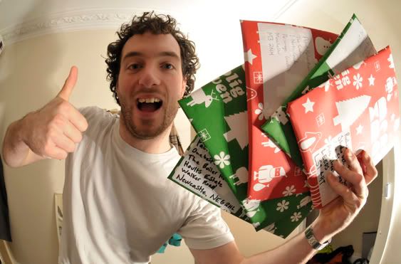
Also the final versions of my book came back from the printers today and straight back into the post to the design companies involved. Again, I still need to get round to taking some nice pictures of this, but you can download a screen resolution PDF copy by clicking right here! (7.37mb)
Photobucket

While at the exhibition I was given a business card from a local company called Radiowaves who specialise in running new media educational projects for school children. I've been designing the logo and visual identity for a project they run called 'Supporter To Reporter' which gets students along to sporting events to interview atheletes and celebrities, as well as working along side people like the BBC and Sky TV. There old logo looked like this:

Photobucket

They were also keen for the new identity to sit well with the Radiowaves logo and the visual identity of parent company synergy TV, which look like this...

Photobucket

Photobucket

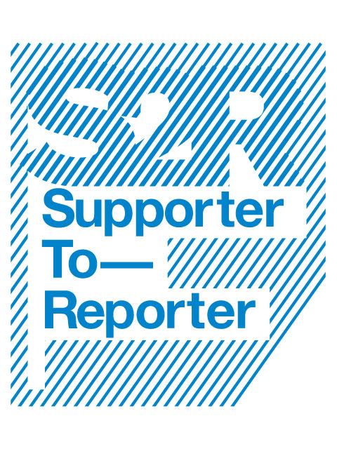
Mixing the blue and white colour scheme from the Radiowaves identity and adopting the typestyle from the synergy identity started to create something clearly linked but slightly differentiated. Taking inspiration from the vertical bars in the Radiowaves logo and italising them for a 'sporty' effect it creates a distinctive look that has plently of room to play with when it comes to implementation.

The new logo.
Photobucket

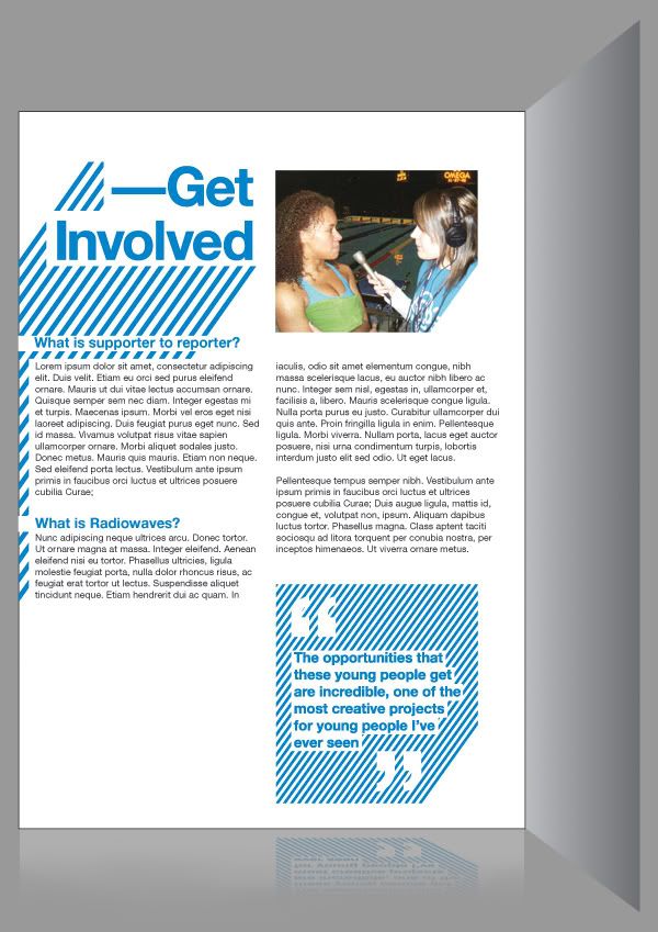
And a rough idea of how the identity could be carried through in a leaflet.
Photobucket

I hope to be helping them out with some implementation work in the new year across the website, some print leaflets and maybe some tshirts as well. Good stuff!

In other news, a few weeks back a guy called Alan Wardle (who is the art editor for computer arts magazine) got in contact with me about using my all the pies font for a little project he wanted to do. He sent over a pic the other day of a logo he had made for one of his friends who is a DJ.

Photobucket

I'm a fan of this, really nice use of the font, it looks great! You can have look at more of his work over on his blog right HERE!

I also found this while surfing the web recently...
PhotobucketPhotobucket


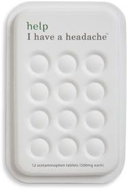
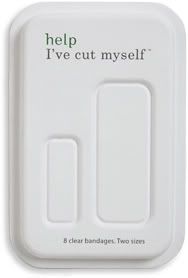
'Help' is a small pharmaceutical company that make plasters and pain killers. Whats great about them is uniquely they don't base their whole company around pseudo-science and space age diagrams showing how their products work, instead they go for a 'innocent smoothies' style humanistic approach. Clean design and great environmentally friendly packaging make them really stand out in this sector. If I ever bought any of that crap I'd definitely buy it off them!

Two other things I've seen recently that I thought were ace are...
Photobucket

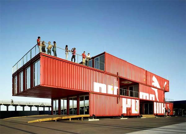
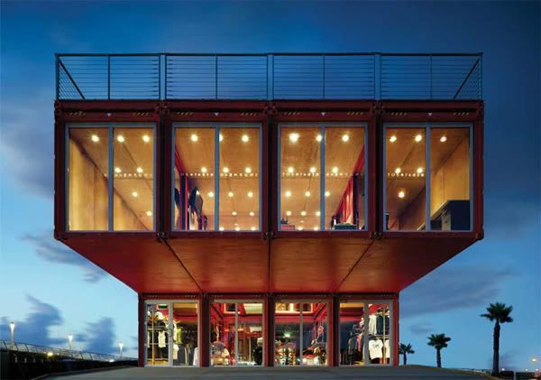
This mobile puma flagship store/display room. Made out of container creates the whole thing can be easily packed up onto lorries or boats. I don't know a lot about architecture, but I think this looks great!
Photobucket

And then...

Photobucket

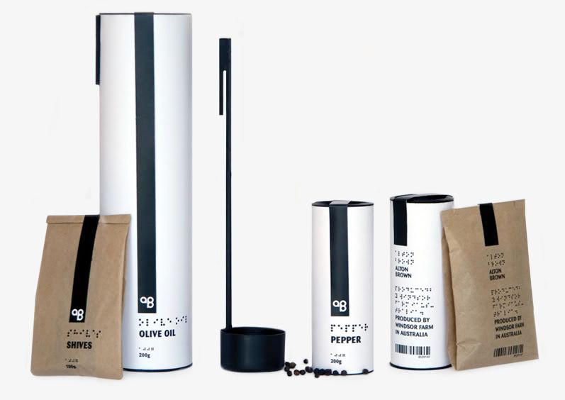
This lad called Hampus Jageland is a few years younger than me and still a student, he has already won several awards and his portfolio is bang-tidy. Above is some branding and packaging for a range of spices and olive oils which are accessible for blind and visually impaired people. Check out the alton brown section of his website for more info.

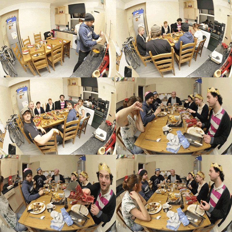
Last night we had a big vegan roast dinner to in our house celebrate the end of a good term at college and to wish farewell to our housemate Tom who is heading off to Canada for six month in a few weeks time!
Photobucket


Good times!
xx
Tuesday, December 02, 2008

It's nearly xmas!


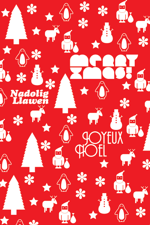
This week I'm going to screen printing some wrapping paper to send my books out in. Here's the design, quite excited about doing this! Been ages since I did any screen printing.
Photobucket
Here's a close up of the lads, I think my favorite is the penguin.
Photobucket
I'll pop some photos up when I print them.

Also!!
My housemate Tom has finally got round to putting his website online, it's a beauty!


Merlin

Saturday, November 29, 2008

macneil t-shirt contest


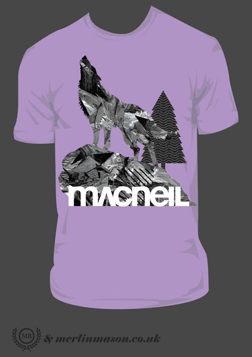
Theres a t-shirt contest going on over at the macneil bikes website, thought I'd have a pop at it...
Photobucket
got some howling wolf action on the go, although with a bit of a twist, got some wild patterns going on inside, heres a close-up.
Photobucket
fingers crossed I win, become famous then marry a super model then we can do drugs in helicopter...

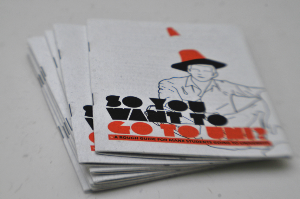
In other news, top Manx export and graphic designing housemate Kyle 'of man' Bibby has recently just had a job he did come back from the printers. It's a leaflet for Isle of Man College with information for students who want to go to university on 'the mainland', he used my AllThePies typeface I designed last year on the cover.
Photobucket
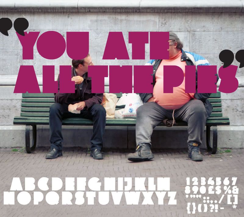
Here's the original type primer.
Photobucket

Also, this guys work keeps on getting more and more amazing everytime I check his site. Negro Nouveau.
Photobucket
Also if you have time, check out the collaboration work he did with a photographer on the Love magazine project, it seems to be a mix of really nice typography and boobs, both of which I'm a fan.

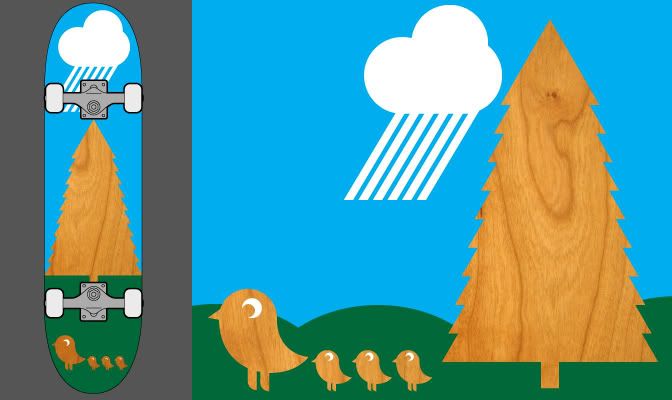
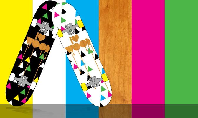
Also decided to have another go at the ongoing design a skateboard competition on popdeck.com. My last entry got shunned for apparently being "too gay" for the American market haha, so here my second attempt.
Photobucket
The idea is using the actual grain of the board in the design makes each deck unique. It references the natural origins of the board which will be used in a primarily urban environment. Hopefully it'll go down a bit better. If you have time you can sign up and vote for my board here.


Woooop ta x

Thursday, November 20, 2008

Recent wot-nots


A couple of things I saw in the news that made me laugh,
Photobucket
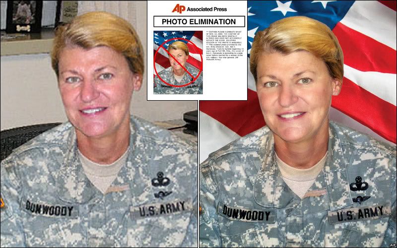
US Military were told off for photoshopping (badly) some of their press releases, tut tut.
And...
Photobucket
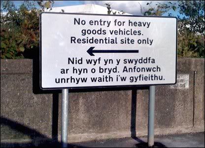
A bit closer to home, the welsh part of this roadsign reads "I'm currently out of the office, please send any work to be translated to." oh well, at least they tried.
Photobucket
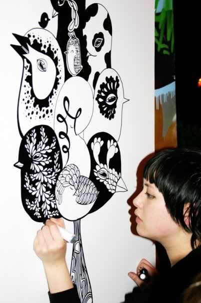
It was best joined up last Friday and my friend Tasha made her way over from Manchester to do a drawing of some jazzy birds, I love it!
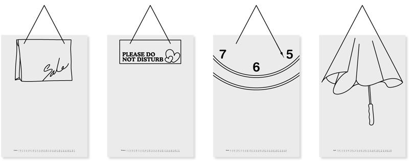
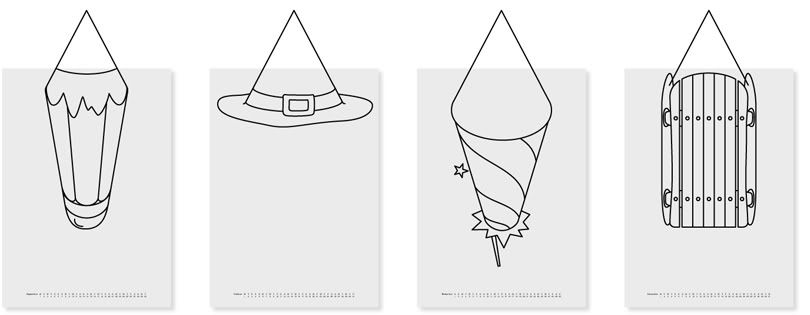
Also found this ace calender on The Chase website.
Photobucket
January//Febuary//March//April//
Photobucket
September//October//November//December//
Apparently the idea came from a dislike from the obtrusive and visually distracting string that calendars hang on, instead of disguising it they incorporated it into the images, ace! I want one!
Photobucket
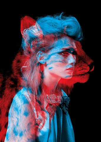
I FFFFFFound this, and I really like it, might have a go at doing something similar.
Photobucket
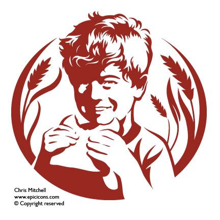
Also recently been checking out the portfolio of Chris Mitchell, epic icons. Some brilliantly illustrated and distilled imagery, they are wonderfully simple yet at the same time full of detail. Good stuff!.
Photobucket
Also saw this branding project from back in 2002 on the Graphic Thought Facility website, I'd always liked that logo but never knew who had designed it. In fact all of their work gets a thumbs up, interesting and visually exciting stuff.
I've been pretty busy finishing stuff off for a fun brief set by Peter Richardson at The Chase, "Convince the public there is an afterlife" I'll put some pictures up very soon!


Right, I'm off to college, Merlin x

Wednesday, November 12, 2008

COOOOOORRR!!

Wheeeeeeey what's this?
Photobucket
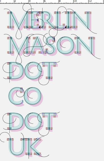
This is a display typeface system called History that consists of 21 layers inspired by the evolution of typography. These 21 independent typefaces share widths and other metric information so that they can be endlessly recombined.
Hit up the typotheque website to have a go!

While on the subject of typography...
Photobucket
Those who know me well will be fully aware of my enthusiasm for energy drinks and interesting typography, it's very rare these things are ever combined but the new branding work on the relentless website is actually quite nice.
Photobucket

Photobucket

Photobucket

Photobucket
There's some really nice ligatures in this typeface, which I'm guessing was custom drawn for the project.
I think all the work has been done by London and Glasgow based brand creation agency Erasmus, but I'm not 100% on that as there website doesn't have any work on it.

Tuesday, November 11, 2008

Mega!

This is probably the most technically amazing advert I've ever seen, yikes!

Friday, November 07, 2008

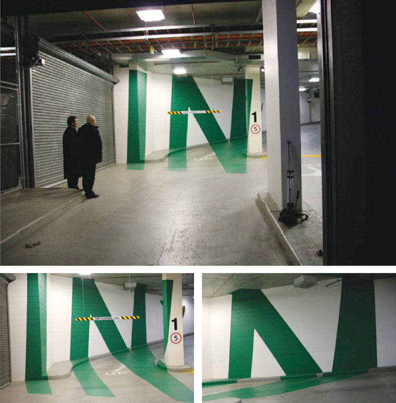
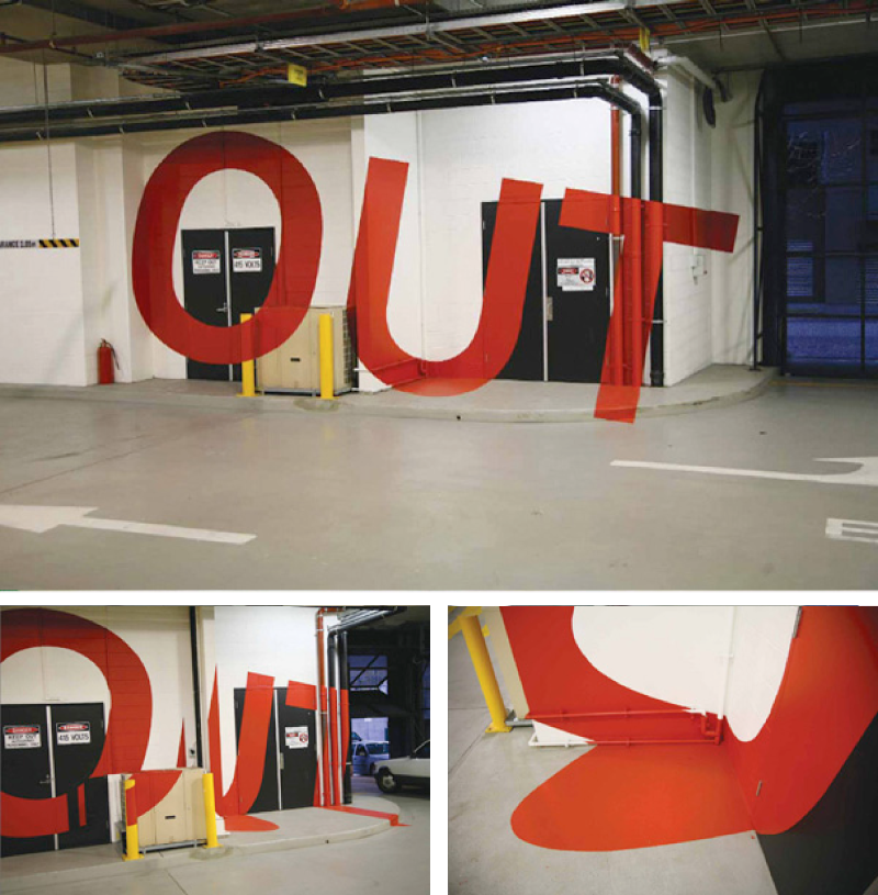
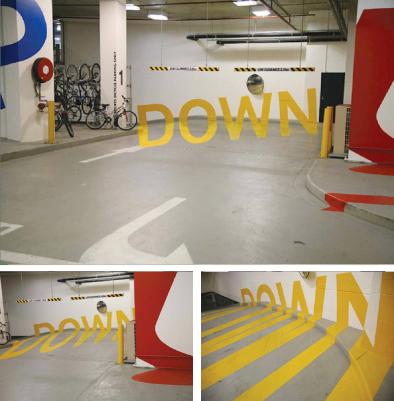
Multistorey carparks arn't always boring.

Fully functional navigation system and visual identity system for a multistory carpark in Melbourne.
Photobucket
I'd seen this quite a few times before but could never remember who had done it! I found it on Australian designer Axel Peemoller's portfolio website, apparently he helped complete the project while at Emery studio in Melbourne.
Photobucket
As much as I'd never consider a carpark to be a tourist destination, I would quite like to go here!
Photobucket

In other news, I'm going to have another go at the skateboard design competition over on popdeck.com, apparently the "I heart wood" logotype I made for the last one, despite being made from wood grain and next to lots of tree's, is "far too gay" for the American market! I'd never really thought of the statement in that context... Americans eh? Oh well, at least they elected somebody without a cowboy hat or 'war' on their list of things to do.

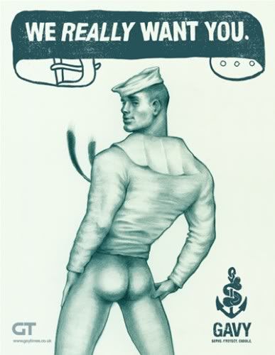
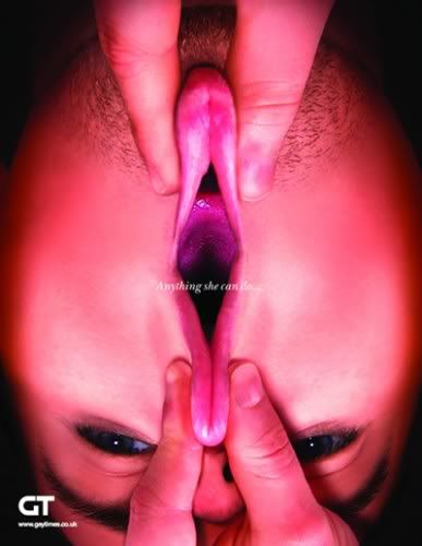
While on the subject of 'gay', I spotted these over on the creative review blog. Here's the official explanation:

Right-wing conservative groups have often accused gay people of having an agenda to promote homosexuality. In response to this, the UK’s Gay Times decided to run an interesting recruitment campaign: selling homosexuality to the straight community. Editor Joseph Galliano explains why he asked five ad agencies to help promote the gay cause…

CR: In light of the recent campaigning in the US, did some of the usual arguments emerging from the far-right help as a starting point for the project?

JG: “Actually, it’s unfortunately much more historical than that. The idea that there’s this ‘homosexual agenda’ is something that has come up many times, over the last 20, 30 years. I find it hilarious, the very idea that gay people might have a coherent set of agendas.

“So I just thought that, if it were true and we were trying to and sell homosexuality, what would it look like? It’s a simple idea really. But the serious point is in highlighting just how ridiculous some of those kinds of attacks are and trying to answer them in a way that’s interesting and creative.”

Photobucket

I think the next one is my personal favorite, it made me laugh, a lot.

Photobucket

I love seeing creative and fun ways to solve problems, and these do the job perfectly, completely trivialising the right wing arguement. GO GAY, YEAHHHH!!!

Wednesday, November 05, 2008

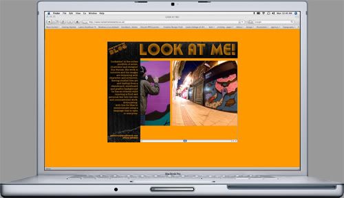
LOOK AT ME!

Just finished building the updated version of illustrator Gus Farnes website. We both developed the format and simplistic navigation system, he then came up with a visual style which I tidied up slightly and then put the whole thing together. It's designed to be really easy to update, and hopefully from now on Gus is fully going to be managing the content. Teamwork!
Photobucket
Lookatmelookatme.co.uk check it out!

Saturday, November 01, 2008

BMW flexiskins

I've never really got excited about cars, I'm pretty sure by the time I can afford to buy one there won't be any petrol left. But, this video about the new skins for BMW cars is really interesting simply as example of completely re-thinking and re-evaluating what is taken for granted. Enjoy

I found this over on the everyoneforever blog, it's an ace inspirational resource covering lots of area outside of traditional graphic design.

Also I think I'm going to submit this at some point over the next few days to the design competition over at popdeck. Any feedback before I do would be lovely! emailmerlin@hotmail.co.uk
Photobucket

Friday, October 24, 2008

Work in progress!

Photobucket
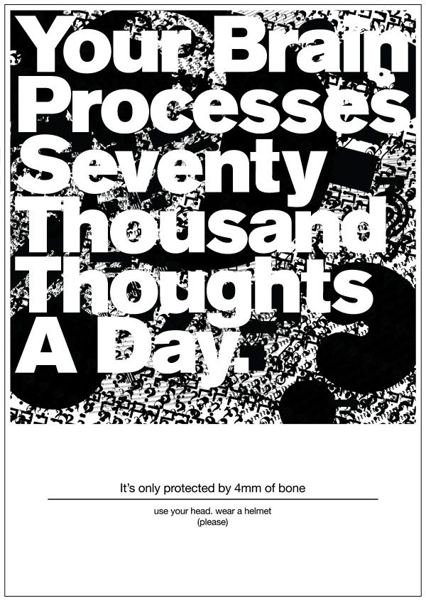
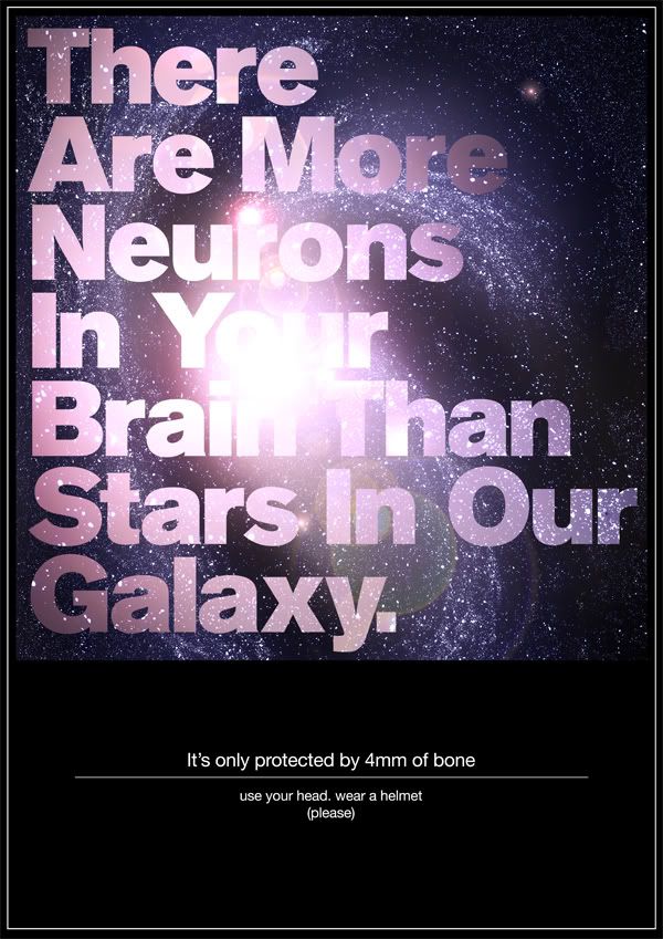
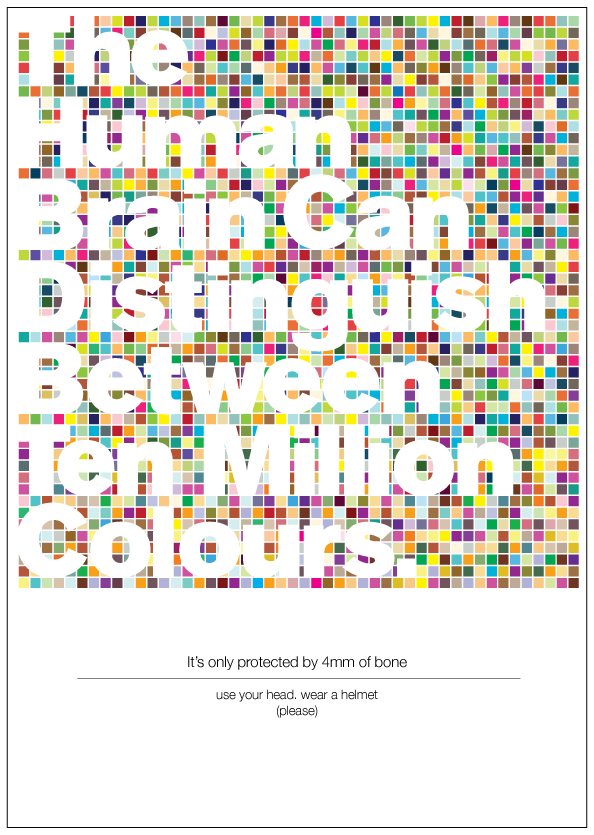
Series of A2 posters trying to persuade 15-25 year olds to wear cycles helmets. Traditionally an audience who do the opposite of what you tell them in regards to 'what is good for you', this hopes to bring them along to the idea on their own terms. In a manner which is stylistically as well as content wise a very different approach to existing material.

(detail of above poster)
Photobucket


Photobucket


Photobucket
The project is being developed into an information pack, more details to follow...

I'm excited for any feedback at this stage, please give me an email at emailmerlin@hotmail.co.uk

Ta! xx
Liverpool Design Symposium

A few of us had a well deserved day out yesterday in the European capital of culture, Liverpool. As well as checking out the massive regeneration program that is still in progress in the city center and around the docks, we also made a trip to the Tate and to the gold at the end of the rainbow aka the Liverpool design symposium.

It took us ages to actually find the event, and we had walk a complete lap of the building it was in twice before we noticed the A5 poster inside the entrance (which just looked like a fire door). But when we got there it was an interesting day.

We started with a lecture by Bruno Maag of Dalton Maag fame. For anybody on my course the words European Graham Tansley should sum it up, but for everybody else this guy is an extremely knowledgeable and opinionated typographer.
Photobucket
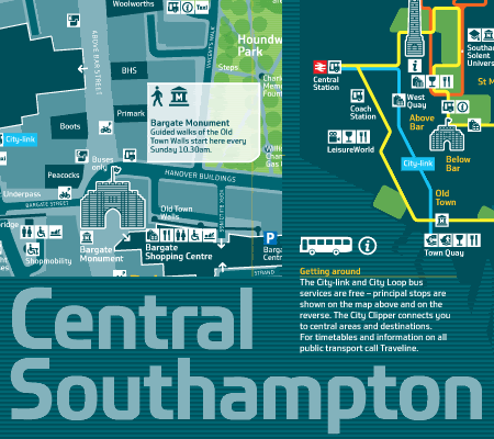
I'm quite a fan of this typeface for Southampton Council, although I'm not sure if this clean Utopian image is an honest representation of Southampton.
Listening to him talk and explain projects it really made me realise how little I know about type, and given me a lot more respect for the industry.
Photobucket
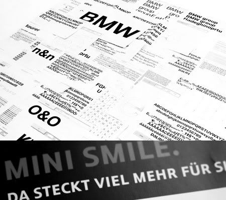
Two typefaces commissioned by BMW, one called Mini which is a custom drawn humanist sans, and another simply called BMW which similarly to Helvetica is designed for neutrality and clarity, but is executed in a different manner.

We also went to a D&AD presentation showcasing a lot of the winning work from last years awards, which was all amazing... really put things in perspective and makes you want to improve your work. I've read in several places before one of the main judging criteria is the "oh I wish I'd though of/done that" factor. I can safely say I thought that about 99% of the work.

Anyway, the final lecture was by Matt Pyke of Universal Everything. He is one a few designers who used to work at Designers Republic (whose website seems to have dissappeared, but they still have there online shop here) and have left to set up there own amazing studios. If you've got time maybe check out yo-lo and build. I've always thought the way his company works is really interesting and potentially the future for some (not all) areas of design. Basically he is the only member of staff, and run's the whole agency out of his garden shed in Sheffield. He then collaborates with a whole range of freelance designers/musicians/programmers etc.

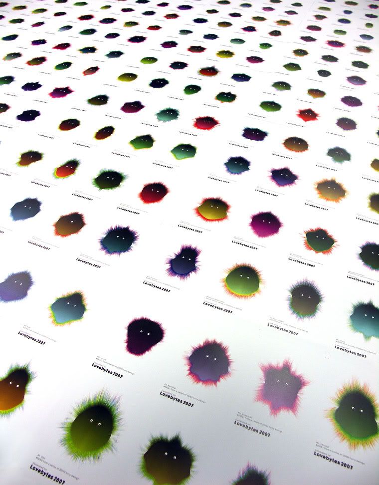
This is a great example of the type of work they do.
Photobucket
20,000 unique postcards trying to get children interested in the lovebytes festival. They were created by programing design parameters and letting the computer randomly create each character.

Photobucket
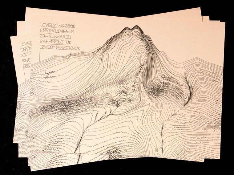
This is a flyer for the event the previous year, plotter patterns inspired by the local landscape of the peak district.

Photobucket
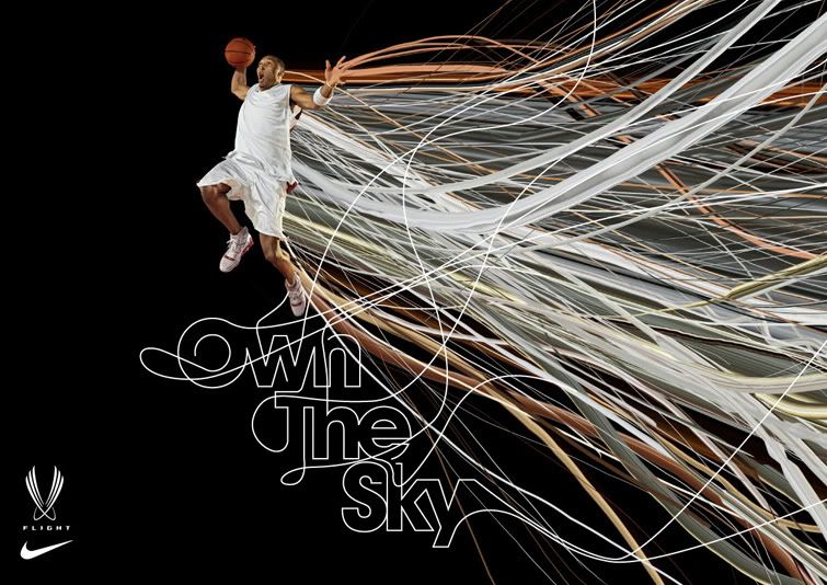
And this is some work they did for Nike.

To be honest most of their stuff is video based, and they have loads of quicktimes embedded into their site. go have a look!

There inspirational site called everyone forever is a great resource of experimental and inventive thing across all areas of life outside the world of graphic design. Definitely worth a look.

Right, I've got some work to crack on with. Ta-raaa xx