//

Monday, November 02, 2009

Pastures New!


I'm sad but also happy to announce that I'm no longer blogging here.

You can catch my latest news on my new website here— http://merlinmason.co.uk/category/blogging/


Merlin x

Thursday, September 24, 2009

The Science of Motivation


Really interesting talk about how business management often hinders progress and performance. I love TED talks!

I find this really interesting when compared to the Million Campaign that won a black pencil at this years D&AD awards... I thought at the time that bribing children wasn't that innovative, and this research would suggest that it isn't that successful either. I also think it's fairly unhealthy to encourage school children that it's not worth trying anything unless you are being materially rewarded.


Merlin x

Monday, September 14, 2009

PHDesign


My friend Kirsty is doing a PHD in some crazystuff that goes straight over my head, she was off to a conference in Newcastle the other day and needed an A0 poster to go by her stand. I helped her out with some typesetting and as you can see by this photo it made her happy.

Photobucket

Unfortunately we missed out on the 'best poster' prize of a box of chocolates to some lad who had loads of pictures of brains all over his. Dang!


Merlin x

Thursday, September 03, 2009

Skateboards!


Been having a play today with the first round of ideas for a skateboard design for Revolutionz in Norwich, here's three initial ideas...
Photobucket
And some close-ups...
Photobucket

Photobucket

Photobucket

More info soon!


Merlin x

Wednesday, September 02, 2009

Studio


Photobucket
We're still trying to fully sort out our new studio, but it's starting to come together now. Please excuse the shoddy phone picture, I'll put some nice ones up here when we're all done.


Merlin x

Jazzy


Photobucket
Here's a little sneakpeak of one of the templates style I'm putting together for the Radiowaves site for when it gets relaunched in November. Haven't done anything like this before, good fun.


Merlin x

A Successful Failure


Me and Kyle recently got invited to put in a pitch for the branding and promotional material of an Antique wallpaper exhibition happening at Temple Newsam. Unfortunately we didn't win, which is a shame as we were excited about it being our next big job after we finish the prospectus, but I was still reasonably happy with what we came up with in the little time we could spare.
Photobucket
I've added a few more pics to the work section, check it out!
Congratulations to whoever won, really looking forward to seeing the final work they produce for it.


Merlin x

Poor mans Quentin Blake


Photobucket
Been a while since I dabbled in any hand-drawn illustration, had a crack at this last time I was in the Synergy office, sorry Quentin...


Merlin x

Sneaky Peaky!


Photobucket
Here's a cheeky quick look at a mock-up for the cover of the LCA prospectus, embossed greyboard with a vinyl sticker. It's been tidied up a bit since I did this screen grab, but you get the idea, should be going to print within the next week or so, I'm excited!


Merlin x

Graffiti thats not crap...


Normally graffiti just involves people writing their name in a way you can't read it, but occasionally you see some really considered, well executed work. I spotted this in Norwich, one of the first places that would be hit if the rising sea level predictions are correct. I really like the origional work by Graphic Thought Facility, and I think the new addition sits well with it!
Photobucket


Merlin x

Sunday, June 28, 2009

The End of the Beginning


Photobucket
We got our results back yesterday, I was very happy and slightly surprised to receive a first! We also took down our degree show exhibition, signifying the end of our time as students. Here's to what comes next, best of luck to everybody on the course.

www.leedsviscom2009.co.uk


Merlin x

Moving House!


Photobucket
I'm downsizing and moving into a lovely little house with Kyle and Cat, we're going to have a studio room which I'll post some pictures of soon. Exciting times, hopefully things will continue to go well and I can pay the rent. While on that subject, on Monday the 6th I'm starting a month of freelance work in the Radiowaves office, looking forward to that!


Merlin x

Friday, June 19, 2009

19.6.09


Haven't updated in a while... Been really busy: finished my course at uni, finished all the promotional work for the end of year exhibition, it opens today at 6pm!

Other news, me and Kyle Bibby won a pitch against other third year students and some graduates from the last few years to design next years prospectus, really excited about this, going to be a really fun project and will make an awesome piece for our portfolios. Also me and Cat Wickes have designed the exhibition guide for our course exhibition, this came back from the guys at Team Impression printers late yesterday, I'll put pictures up soon. We spent some time developing the fold pattern and structuring of information and I'm really pleaed with how it turned out. 29.7 x 29.7 folded into 16 pages with one colour litho print onto 120gsm kaskad tinted stock, ace!

Time for some pics...

Photobucket
Press ad for the end of year show in Freize Magazine

Photobucket
Quick poster for the 'No Leeds-Bradford Airport Expansion' group.

Photobucket

Photobucket
My final entries for a Don't Panic flyer design competition from a few months back.

Photobucket

Photobucket
Me and Kyle have been art directing photographer Adrian Ray while working on the content for next years prospectus. He's really talent and a nice guy to boot! (These are low-res and still to be fully colour corrected).

Photobucket

Photobucket
Some more work for ThisIsNotForCharity is currently at the printers, five different types of flyers and some t-shirts. Julian left on his round the world cycling adventure last week, the GPS live tracking system is now working over on the follow section of the site.

I think that will do the for the moment, I need to get some sleep before my parents turn up! I'm planning to give the site a full overhaul and add lots of new projects in the next few weeks... watch this space!


Merlin x

Monday, June 08, 2009

S2R wins at Yorkshire Digital Awards


Just found out that the S2R program I branded for new media educational network Radiowaves has won 'best E-learning initiative' at the Yorkshire Digital Awards.

The judges said they were “particularly impressed by the way the site empowered teenagers.

I'm really happy about being involved in such a great programme, congratulations to all the team at Radiowaves.

Full story here — http://www.synergy.tv/?p=510


Merlin x

Sunday, June 07, 2009

Geoff McFetridge


This is really nice, so many subtle things happening here.


Merlin x

Thursday, May 21, 2009

Trevor Baylis


If you've got a spare few minutes... I've been listening to this while doing some work, truly inspiring. Trevor Baylis is the guy who invented, along with a lot of other things, the wind-up radio. He's down to earth, honest and passionate.


Merlin

Tuesday, May 19, 2009

Hope Not Hate


Things are hotting up for the European Elections and the Local Elections (both 18.5.09).
Interesting to see the different styles in Party Political Broadcasts, on the most part they are absolutely dire, it's hard to image how somebody might organise a whole country if they can't even manage to rustle up a three minute video telling you what they think.

By far the best visually and content wise (it actually gave a hint to policies!) was the green party video.
Green Party Video. (bbc iplayer)

The conservatives managed to avoid all mention of their policy's and just banged on about MP's expenses.

Labour just banged on about the Conservatives.

Lib Dems, talked about a few of their policies, the politics of which were far more convincing than the studio audience asking the questions.

The worst (although closely followed by one-trick-pony UKIP) was the BNP.
BNP Video. (bbc iplayer).

They boast there achievements so far as having installed two CCTV cameras in the Midlands, but also claim they have a policy of "no big-brother rubbish". They also promise "No tax money being spent on PC minority projects", god only knows what they mean by this, but you can imagine it's not good news for a whole array of community projects that do far more for society than two cameras. On top of this, the fact they are Nazi scum bags who attempt to aggravate and tear apart our community means they won't be getting my vote.

I watched all these the same day as this Hope not Hate leaflet came through our door. It's produced by anti-fascist magazine Searchlight. Seems like a really good campaign getting all sorts of people, celebrities etc, to denounce the BNP. I especially like the way it doesn't assume to tell you who to vote for, instead it just encourages involvment in the voting process for anybody other than the BNP.

Me and Kyle were talking about it over some Linda Macartney Pies, and came up with a couple of fun ideas for how the leaflet could be expanded into a poster and billboard campaign. Thought I'd have a quick go at mocking these up today, if I get time I might try and print some of these out and stick them up wherever the BNP get the highest votes from in Leeds.

Photobucket

Photobucket

I think this second one could be worked on a bit more to make it look more like it was bursting out of the side of the billboard. Right, I'm off to cook some British food (beans on toast) for British people (myself)!


Merlin x

Absolutely Brilliant


Friday, May 15, 2009

Toilets & Signage


As part of the work I'm doing for the promotion of the End of Year Show (19th — 25th June '09!!!) I'm designing an exhibition guide map and on site signage. For a while now I have developed a dislike for toilet signage, and in particular for the disabled icon, and this project seemed like a perfect opportunity to try and tackle the issue.

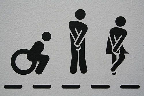
My 'problem' as such with toilet and disabled iconography in general is that at best it's sexist, and at worst very offensive and grossly inaccurate. It defines men as people who wear suits, women as people who wear dresses and defines disabled people by a mode of transport.

Photobucket

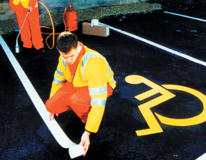
The disabled icon was originally produced by Danish designer Sussanne Koefoed in 1969. Technically, as icons go it's quite good, simple, one colour, reproduces well on small and large scale and is easily tranlatable into things such as carpark signage (see above). Unfortunately the icon doesn't tackle the complex issues of diversity within disability.

Photobucket

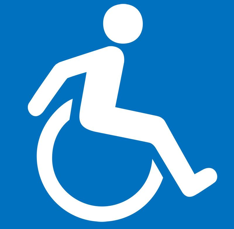
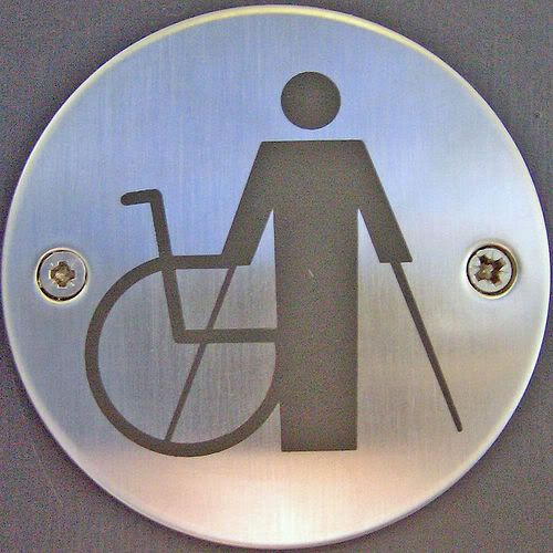
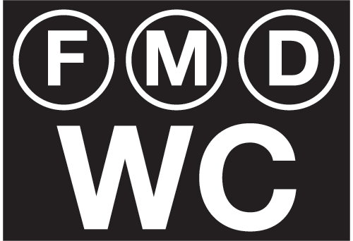
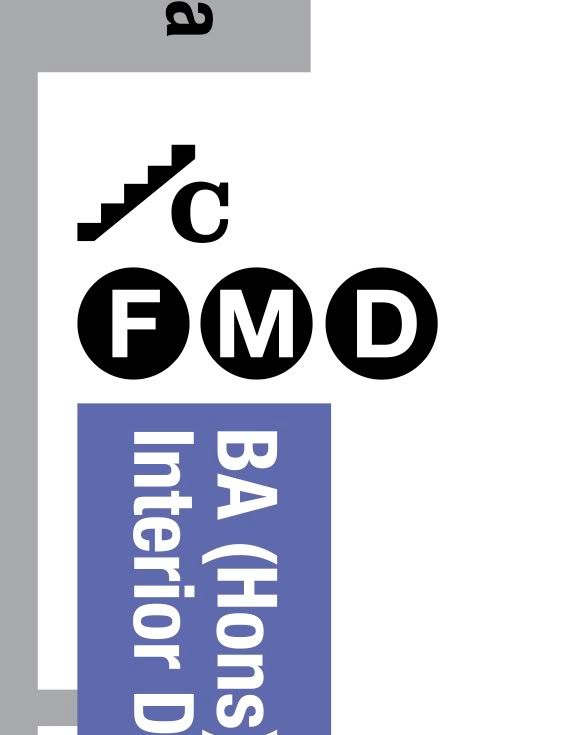
There have been a few slight variations of this original logo (such as the one above) which hint at a level independence. There have also been attempts to broaden the scope of disabilities covered by the symbols (see below), but this route of a literal visual representation soon becomes complex even when trying to visualise the basic categories of disability — hearing, sight, mobility and cognitive. In truth, behind these headings it is a far more complex issue with varying degree's of severeness and less easy to categorise, especially visually.

Photobucket

Photobucket

Photobucket

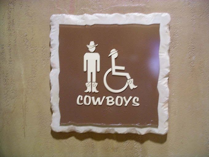
While humor may be a good substitute (see below), it still doesn't really solve the problem.

Photobucket

Photobucket

In North America roughly 17% of overall population are registered as disabled. Of the 306 million population this means 61 million have some form of disability. But only 5% of disabled people actually use wheelchairs, around 3 million people. This leaves 58 million disabled people who are effectively stigmatised by a logo that has no relevance to them, not exactly ideal. Why should an elderly person who needs a handle next to the toilet be iconified by a wheel chair?

"In iconography stick figures are generally used to describe the most simple of concepts - gender, activities and basic actions. The simple human form is far too ambiguous to start trying to describe anything more complicated." — Neil Cummings

So how else can this be done?

Photobucket

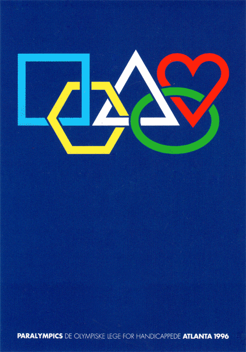
This poster (above) from the 1996 Atlanta Paralympics uses abstract shapes in a rework of the Olympic logo as a celebration of diversity. I saw this full size at the 'Century of Olympic Posters' exhibition at the V&A last year and think it's amazing; beautiful and simple.

Apple have tackled the problem in a completely different way on their computer systems with the 'universal access' software. Copywritting wise it's a nice way of turning a problem on it's head, and the Da Vinci-esque logo seems to be all about the new-found ability and liberation rather than the lack of such things. Having said this, I think it works well in this context, but the idea of a 'universal access toilet' sounds like some condescending over-pc 'newspeak' that pussyfoots around a problem.


Photobucket

For the end of year show map I've simplified my toilet signage down to a New York subway style letters in circles. By no means do I present this as a solution to the problem, I had far less time than I would have liked to work on it and the use of the disabled icon goes well beyond toilet signs, but I do feel it's a step in the right direction. The symbols are purpously arranged the way they are because of the student/staff demographic of the college; mainly female, followed by male then people who would use disabled facilities.

Photobucket

Here's a snippet of them in context on the guide map...

Photobucket
I hope to get a chance to develop this line of thinking further in the future, and welcome any suggestions or examples of other similar projects — info (at) merlinmason.co.uk

Merlin x

Wednesday, May 13, 2009

This is Beautiful


Skate - Life is Complicated. Sport is Simple from howies on Vimeo.


howies.co.uk
Incidentally, they've also just agreed to sponsor Julian with some cycling shorts for his round the world journey. We also got their new catalog through the post this morning, it's amazing, I honestly think they're the best clothing company out there, I just wish I could afford to buy their stuff!


Merlin x

Monday, April 27, 2009

27.4.09


This is going to be short and sweet, I'm tired, it's late and I've got to be up early!

First up, I've been busy over the last week putting together a website for bicycle circumnavigation world record challenger Julian Emre Sayarer, it's just gone live this evening although it still has a few things to be added to it.

Photobucket

His bike ride essentially a protest against so many things in todays society which he feels are sliding away from us as individuals and losing their meaning. He has written a great manifesto on the site and if you have time please give it a read!

Photobucket

The visual style for the whole thing was influenced heavily by this quote (from creative review I think) describing last years climate camp visual identity by UHC.

"The crisp design produced by the Climate Camp is removed from the typical anarchist/Marxist/revolutionary visual codes of earlier activists movements. The Climate Camp’s graphic identity aims to be attractive to everyday people; it is accessible and asks everyone to participate. Gone are the stencilled or dirty grunge fonts that are identified with your counter-cultures. In an era when our rebellion has been sold back to us for so long that the aesthetics of rebellion are virtually meaningless, the Climate Camp has avoided positioning itself with any of the counter-culture based identity politics of earlier activists movements that could never escape the anarchist ghetto. So far, the camp has stayed clear of old ideology-based rhetoric and imagery, but is a constant battle to maintain a fresh perspective and communications strategy."

Photobucket

ThisIsNotForCharity

In other news I've also been developing the visual identity for the Leeds College of art end of year show. Here's a sneaky glimpse at a print ad for Kult Magazine. Also working on adverts for creative review, freize magazine as well as VIP invites, posters, on site signage, window graphics and exhibition guides. More soon!

Photobucket

I've also been playing with my camera a little bit which has been a fun break from working.

Photobucket

Took this snap of a squirrel outside my house eating a chicken leg, my first official steps into wildlife photography!

It also earned photo of the day over on the DIG Magazine website, ace!

Photobucket

I also took this a few weeks back during the WWF (wildlife not wrestling) earth hour.

Photobucket

I think that about does it, I'm off to bed!


Merlin x

Friday, April 03, 2009

The Rozza's!


The police have been in the news quite a lot this week in regards to their reaction to the G20 protests in London. Beating the general public simply because they disagree with the government is a touch heavy handed, and about as unforgivable as the shoddy design work they've been pumping out!

This is the poster in question, it is a national campaign commissioned by the Home Office.

Photobucket

Firstly, the law changed quite significantly back in 1994 and this version of rights is 15 years out of date. More importantly though, the typographic hierarchy completely changes the message; it creates a lack of clarity that suggests the mumbling of somebody's rights and potentially gives the impression that the police are misleading people. It could also be seen as threatening, the police at the best of times are seen as a bit imposing, and a poster that suggests it's arresting you (badly) doesn't really help their public relations. More importantly the actual message that they want to talk to the community is completely lost while you try to work out what the hell is going on for the 2 seconds that it has your attention.

This one was positioned on a main road and would mainly be seen by passing traffic.

Photobucket

Even at this distance any hope of getting the message is lost.

The format of the poster is fairly well known and originates from this second world war poster.

Photobucket

The difference between the two posters is the original poster is a simple straight forward message, not a poor piece of copy writing that requires reading the small print to make sense. Secondly the small 'and' on the original is an unnecessary part of the message, if read from a distance it still makes sense.

This was parodied quite nicely recently by Howies, and again, the small part of the type is unessential to the message.

Photobucket

Another poster in the same police series, again with the same problem.

Photobucket

Oh well, I graduate in a few months and have the joy of council tax to look forward to again, hopefully mine will be spent on something a bit more constructive.


Merlin x

Saturday, March 28, 2009

Creative Review


This is amazing!


Merlin

28.3.09


Haven't updated this for a few weeks now, been exceptional busy! Here's a quick overview of what I've been doing.

Firstly, I went snowboarding for a week in Avoriaz. We had the most amazing weather, and the snow was perfect. Took my new camera aswell, here's a couple of snaps.

Photobucket

Photobucket

Photobucket

As soon as I got back from holiday I started my four week placement at Elmwood in Leeds. Now two weeks into it and it's going really well, been working on some fun projects and I can feel myself learning new things by the day.

Also on my return from France I discovered that I had won the competition to design the end of year show promotional material at college with my 'end of the beginning' idea. Really pleased about that, such a great note to leave the college on!

On the subject of college, in the evening this week I've been putting together a proposal to design the posters and promotional material for a series of professional lectures at college. Here's a quick peek of a mock up of one of the routes.

Photobucket

I'm hoping to print these at footprint in Leeds on recycled coloured paper using soy ink.

Last Wednesday me and a couple of the guys from elmwood jumped on the train up to Newcastle to go to the Micheal C Place lecture at Dance City.

Photobucket

It took on an interview format with Adrian Shaugnessy asking the questions and being an all round good host.

Photobucket

Photobucket

It's always interesting to hear about people's success's and their failures, and the talk definitly had a more honest and complete approacher rather than just using it as an opportunity to show off.

Other interesting stuff I've seen and thought 'ooh, I'll do a blog about that' includes; lifestyle clothing brand Insight have put all they're old adverts up on their website. Some really interesting and powerful art direction going on here. Check it out by clicking right here.

Photobucket

Photobucket

Also found this online gallery of amazing Lego advertising.

Photobucket

As far as I'm aware, everybody in the world loves Lego, and it's great to see the creativity it inspires to younger childeren is still alive in some adult designers.

Thats all for the moment, need to crack on with some work!


Merlin x