Thursday, May 21, 2009
Trevor Baylis
If you've got a spare few minutes... I've been listening to this while doing some work, truly inspiring. Trevor Baylis is the guy who invented, along with a lot of other things, the wind-up radio. He's down to earth, honest and passionate.
Merlin
Tuesday, May 19, 2009
Hope Not Hate
Things are hotting up for the European Elections and the Local Elections (both 18.5.09).
Interesting to see the different styles in Party Political Broadcasts, on the most part they are absolutely dire, it's hard to image how somebody might organise a whole country if they can't even manage to rustle up a three minute video telling you what they think.
By far the best visually and content wise (it actually gave a hint to policies!) was the green party video.
Green Party Video. (bbc iplayer)
The conservatives managed to avoid all mention of their policy's and just banged on about MP's expenses.
Labour just banged on about the Conservatives.
Lib Dems, talked about a few of their policies, the politics of which were far more convincing than the studio audience asking the questions.
The worst (although closely followed by one-trick-pony UKIP) was the BNP.
BNP Video. (bbc iplayer).
They boast there achievements so far as having installed two CCTV cameras in the Midlands, but also claim they have a policy of "no big-brother rubbish". They also promise "No tax money being spent on PC minority projects", god only knows what they mean by this, but you can imagine it's not good news for a whole array of community projects that do far more for society than two cameras. On top of this, the fact they are Nazi scum bags who attempt to aggravate and tear apart our community means they won't be getting my vote.
I watched all these the same day as this Hope not Hate leaflet came through our door. It's produced by anti-fascist magazine Searchlight. Seems like a really good campaign getting all sorts of people, celebrities etc, to denounce the BNP. I especially like the way it doesn't assume to tell you who to vote for, instead it just encourages involvment in the voting process for anybody other than the BNP.
Me and Kyle were talking about it over some Linda Macartney Pies, and came up with a couple of fun ideas for how the leaflet could be expanded into a poster and billboard campaign. Thought I'd have a quick go at mocking these up today, if I get time I might try and print some of these out and stick them up wherever the BNP get the highest votes from in Leeds.
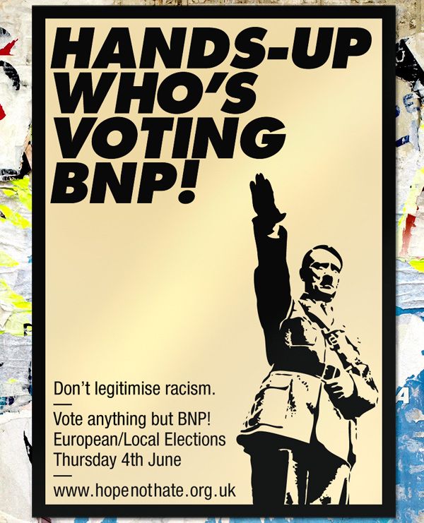
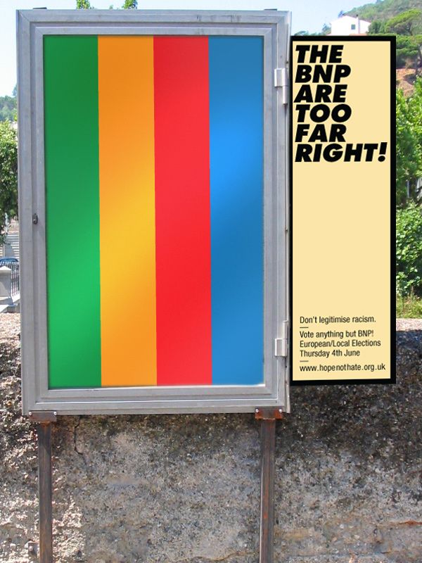
I think this second one could be worked on a bit more to make it look more like it was bursting out of the side of the billboard. Right, I'm off to cook some British food (beans on toast) for British people (myself)!
Merlin x
Friday, May 15, 2009
Toilets & Signage
As part of the work I'm doing for the promotion of the End of Year Show (19th — 25th June '09!!!) I'm designing an exhibition guide map and on site signage. For a while now I have developed a dislike for toilet signage, and in particular for the disabled icon, and this project seemed like a perfect opportunity to try and tackle the issue.
My 'problem' as such with toilet and disabled iconography in general is that at best it's sexist, and at worst very offensive and grossly inaccurate. It defines men as people who wear suits, women as people who wear dresses and defines disabled people by a mode of transport.
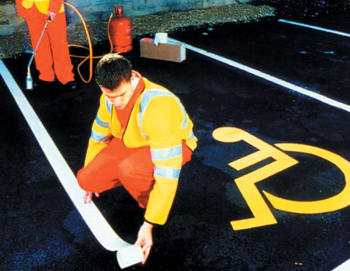
The disabled icon was originally produced by Danish designer Sussanne Koefoed in 1969. Technically, as icons go it's quite good, simple, one colour, reproduces well on small and large scale and is easily tranlatable into things such as carpark signage (see above). Unfortunately the icon doesn't tackle the complex issues of diversity within disability.
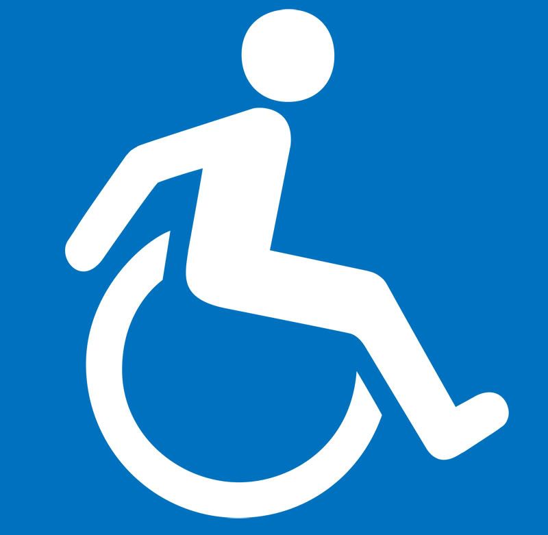
There have been a few slight variations of this original logo (such as the one above) which hint at a level independence. There have also been attempts to broaden the scope of disabilities covered by the symbols (see below), but this route of a literal visual representation soon becomes complex even when trying to visualise the basic categories of disability — hearing, sight, mobility and cognitive. In truth, behind these headings it is a far more complex issue with varying degree's of severeness and less easy to categorise, especially visually.
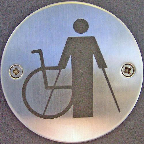

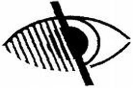
While humor may be a good substitute (see below), it still doesn't really solve the problem.
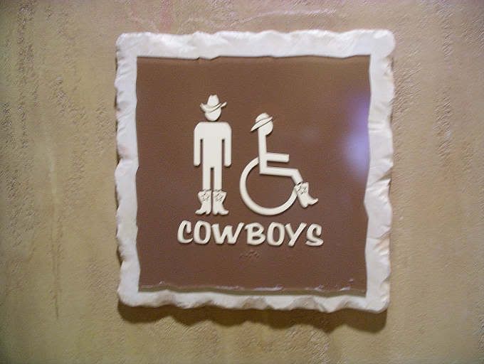
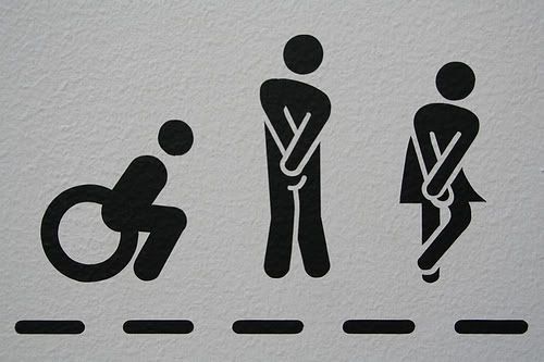
In North America roughly 17% of overall population are registered as disabled. Of the 306 million population this means 61 million have some form of disability. But only 5% of disabled people actually use wheelchairs, around 3 million people. This leaves 58 million disabled people who are effectively stigmatised by a logo that has no relevance to them, not exactly ideal. Why should an elderly person who needs a handle next to the toilet be iconified by a wheel chair?
"In iconography stick figures are generally used to describe the most simple of concepts - gender, activities and basic actions. The simple human form is far too ambiguous to start trying to describe anything more complicated." — Neil Cummings
So how else can this be done?
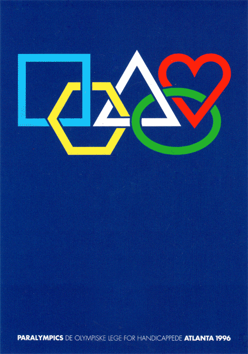
This poster (above) from the 1996 Atlanta Paralympics uses abstract shapes in a rework of the Olympic logo as a celebration of diversity. I saw this full size at the 'Century of Olympic Posters' exhibition at the V&A last year and think it's amazing; beautiful and simple.
Apple have tackled the problem in a completely different way on their computer systems with the 'universal access' software. Copywritting wise it's a nice way of turning a problem on it's head, and the Da Vinci-esque logo seems to be all about the new-found ability and liberation rather than the lack of such things. Having said this, I think it works well in this context, but the idea of a 'universal access toilet' sounds like some condescending over-pc 'newspeak' that pussyfoots around a problem.

For the end of year show map I've simplified my toilet signage down to a New York subway style letters in circles. By no means do I present this as a solution to the problem, I had far less time than I would have liked to work on it and the use of the disabled icon goes well beyond toilet signs, but I do feel it's a step in the right direction. The symbols are purpously arranged the way they are because of the student/staff demographic of the college; mainly female, followed by male then people who would use disabled facilities.
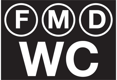
Here's a snippet of them in context on the guide map...
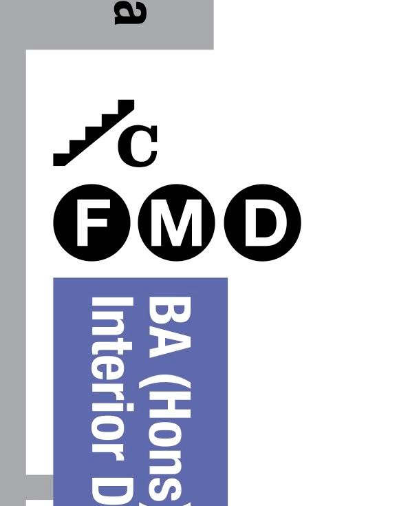
I hope to get a chance to develop this line of thinking further in the future, and welcome any suggestions or examples of other similar projects — info (at) merlinmason.co.uk
Merlin x
Wednesday, May 13, 2009
This is Beautiful
Skate - Life is Complicated. Sport is Simple from howies on Vimeo.
howies.co.uk
Incidentally, they've also just agreed to sponsor Julian with some cycling shorts for his round the world journey. We also got their new catalog through the post this morning, it's amazing, I honestly think they're the best clothing company out there, I just wish I could afford to buy their stuff!
Merlin x
Subscribe to:
Posts (Atom)