The police have been in the news quite a lot this week in regards to their reaction to the G20 protests in London. Beating the general public simply because they disagree with the government is a touch heavy handed, and about as unforgivable as the shoddy design work they've been pumping out!
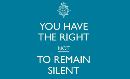
This is the poster in question, it is a national campaign commissioned by the Home Office.
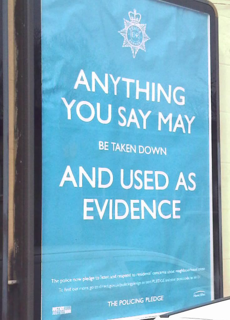
Firstly, the law changed quite significantly back in 1994 and this version of rights is 15 years out of date. More importantly though, the typographic hierarchy completely changes the message; it creates a lack of clarity that suggests the mumbling of somebody's rights and potentially gives the impression that the police are misleading people. It could also be seen as threatening, the police at the best of times are seen as a bit imposing, and a poster that suggests it's arresting you (badly) doesn't really help their public relations. More importantly the actual message that they want to talk to the community is completely lost while you try to work out what the hell is going on for the 2 seconds that it has your attention.
This one was positioned on a main road and would mainly be seen by passing traffic.
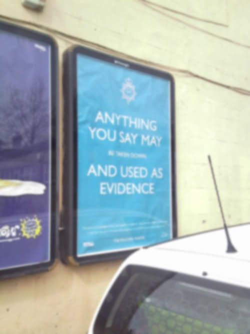
Even at this distance any hope of getting the message is lost.
The format of the poster is fairly well known and originates from this second world war poster.
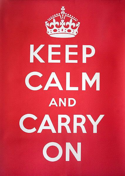
The difference between the two posters is the original poster is a simple straight forward message, not a poor piece of copy writing that requires reading the small print to make sense. Secondly the small 'and' on the original is an unnecessary part of the message, if read from a distance it still makes sense.
This was parodied quite nicely recently by Howies, and again, the small part of the type is unessential to the message.
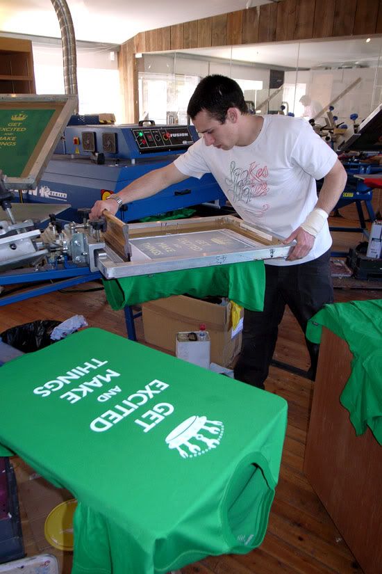
Another poster in the same police series, again with the same problem.
Oh well, I graduate in a few months and have the joy of council tax to look forward to again, hopefully mine will be spent on something a bit more constructive.
Merlin x