Saturday, November 29, 2008

macneil t-shirt contest


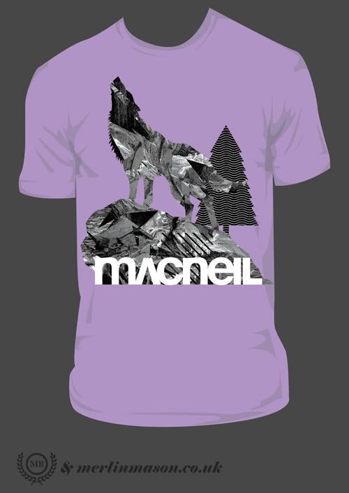
Theres a t-shirt contest going on over at the macneil bikes website, thought I'd have a pop at it...
Photobucket
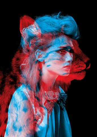
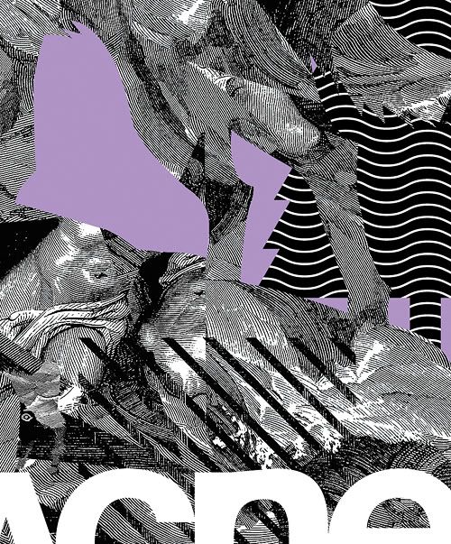
got some howling wolf action on the go, although with a bit of a twist, got some wild patterns going on inside, heres a close-up.
Photobucket
fingers crossed I win, become famous then marry a super model then we can do drugs in helicopter...

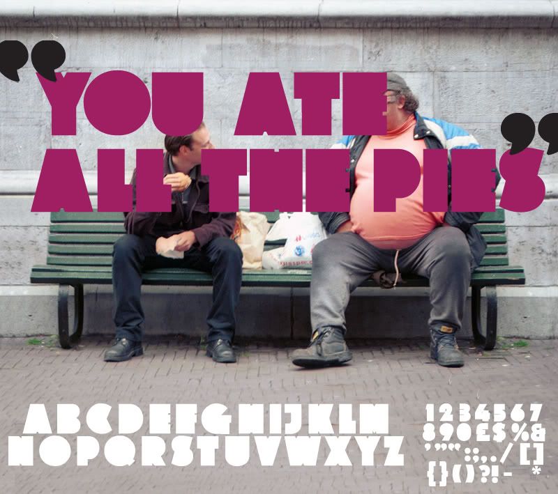
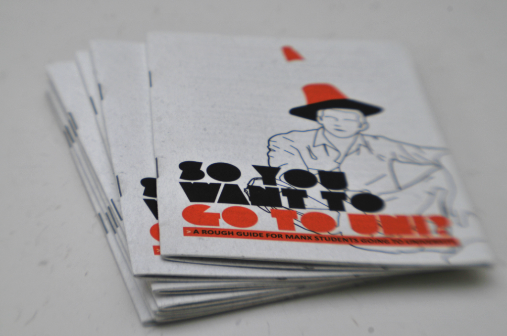
In other news, top Manx export and graphic designing housemate Kyle 'of man' Bibby has recently just had a job he did come back from the printers. It's a leaflet for Isle of Man College with information for students who want to go to university on 'the mainland', he used my AllThePies typeface I designed last year on the cover.
Photobucket
Here's the original type primer.
Photobucket

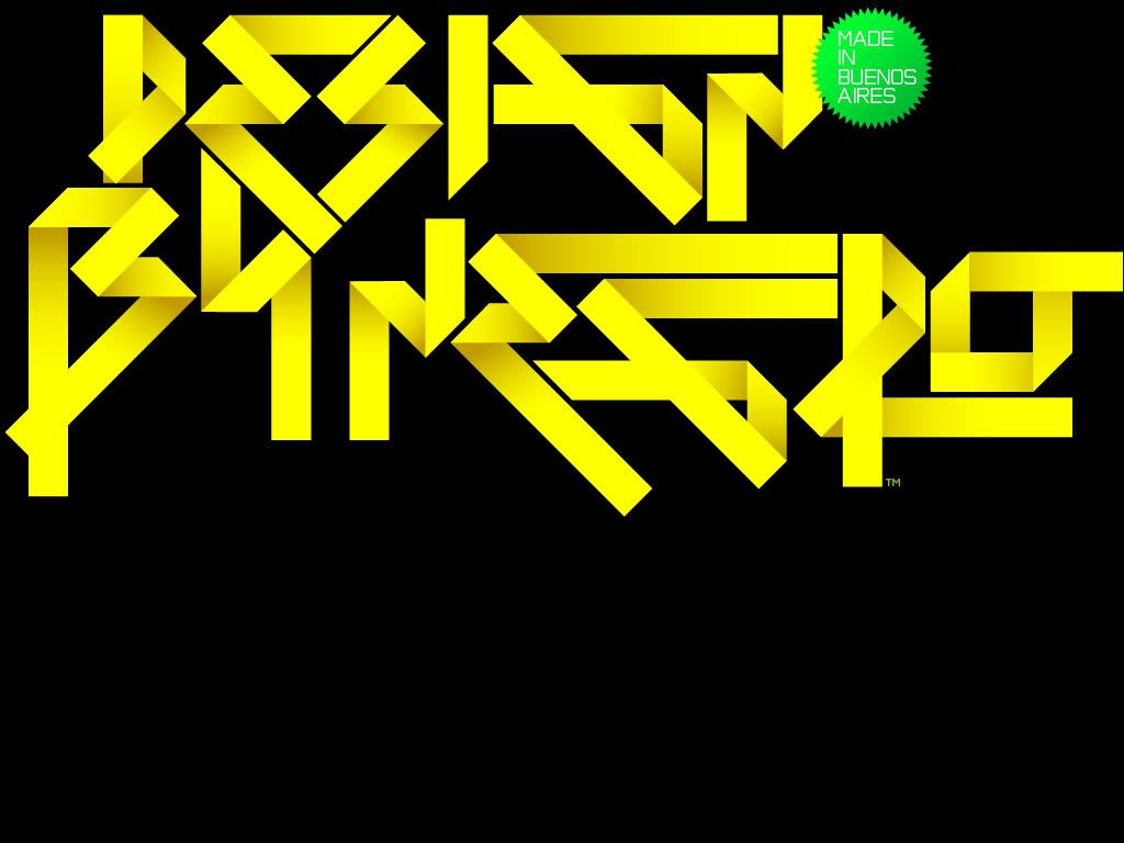
Also, this guys work keeps on getting more and more amazing everytime I check his site. Negro Nouveau.
Photobucket
Also if you have time, check out the collaboration work he did with a photographer on the Love magazine project, it seems to be a mix of really nice typography and boobs, both of which I'm a fan.

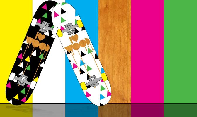
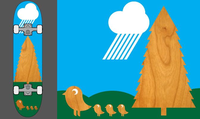
Also decided to have another go at the ongoing design a skateboard competition on popdeck.com. My last entry got shunned for apparently being "too gay" for the American market haha, so here my second attempt.
Photobucket
The idea is using the actual grain of the board in the design makes each deck unique. It references the natural origins of the board which will be used in a primarily urban environment. Hopefully it'll go down a bit better. If you have time you can sign up and vote for my board here.


Woooop ta x
Thursday, November 20, 2008

Recent wot-nots


A couple of things I saw in the news that made me laugh,
Photobucket
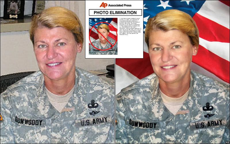
US Military were told off for photoshopping (badly) some of their press releases, tut tut.
And...
Photobucket
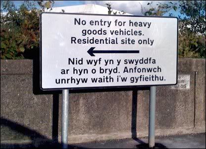
A bit closer to home, the welsh part of this roadsign reads "I'm currently out of the office, please send any work to be translated to." oh well, at least they tried.
Photobucket
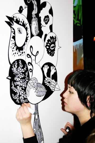
It was best joined up last Friday and my friend Tasha made her way over from Manchester to do a drawing of some jazzy birds, I love it!
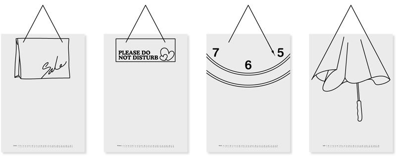
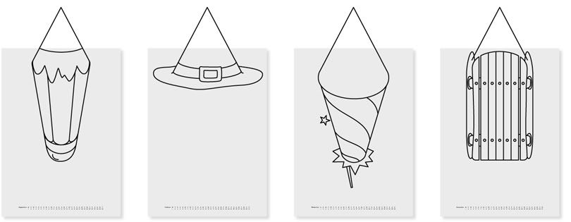
Also found this ace calender on The Chase website.
Photobucket
January//Febuary//March//April//
Photobucket
September//October//November//December//
Apparently the idea came from a dislike from the obtrusive and visually distracting string that calendars hang on, instead of disguising it they incorporated it into the images, ace! I want one!
Photobucket
I FFFFFFound this, and I really like it, might have a go at doing something similar.
Photobucket
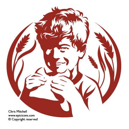
Also recently been checking out the portfolio of Chris Mitchell, epic icons. Some brilliantly illustrated and distilled imagery, they are wonderfully simple yet at the same time full of detail. Good stuff!.
Photobucket
Also saw this branding project from back in 2002 on the Graphic Thought Facility website, I'd always liked that logo but never knew who had designed it. In fact all of their work gets a thumbs up, interesting and visually exciting stuff.
I've been pretty busy finishing stuff off for a fun brief set by Peter Richardson at The Chase, "Convince the public there is an afterlife" I'll put some pictures up very soon!


Right, I'm off to college, Merlin x

Wednesday, November 12, 2008

COOOOOORRR!!

Wheeeeeeey what's this?
Photobucket
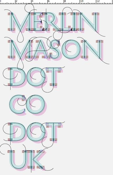
This is a display typeface system called History that consists of 21 layers inspired by the evolution of typography. These 21 independent typefaces share widths and other metric information so that they can be endlessly recombined.
Hit up the typotheque website to have a go!

While on the subject of typography...
Photobucket
Those who know me well will be fully aware of my enthusiasm for energy drinks and interesting typography, it's very rare these things are ever combined but the new branding work on the relentless website is actually quite nice.
Photobucket

Photobucket

Photobucket

Photobucket
There's some really nice ligatures in this typeface, which I'm guessing was custom drawn for the project.
I think all the work has been done by London and Glasgow based brand creation agency Erasmus, but I'm not 100% on that as there website doesn't have any work on it.

Tuesday, November 11, 2008

Mega!

This is probably the most technically amazing advert I've ever seen, yikes!

Friday, November 07, 2008

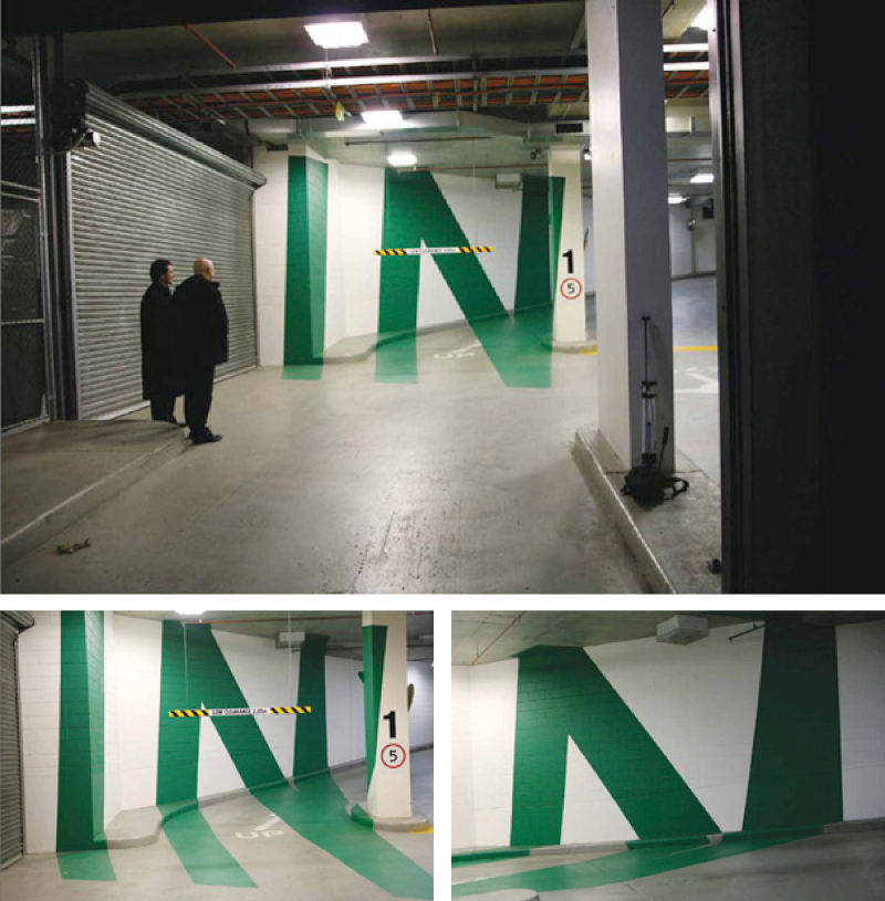
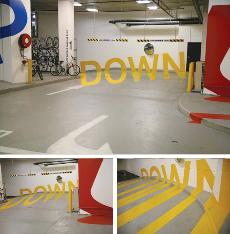
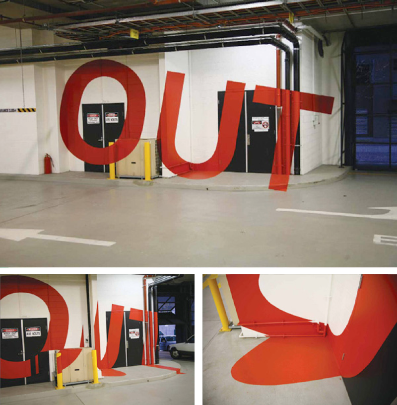
Multistorey carparks arn't always boring.

Fully functional navigation system and visual identity system for a multistory carpark in Melbourne.
Photobucket
I'd seen this quite a few times before but could never remember who had done it! I found it on Australian designer Axel Peemoller's portfolio website, apparently he helped complete the project while at Emery studio in Melbourne.
Photobucket
As much as I'd never consider a carpark to be a tourist destination, I would quite like to go here!
Photobucket

In other news, I'm going to have another go at the skateboard design competition over on popdeck.com, apparently the "I heart wood" logotype I made for the last one, despite being made from wood grain and next to lots of tree's, is "far too gay" for the American market! I'd never really thought of the statement in that context... Americans eh? Oh well, at least they elected somebody without a cowboy hat or 'war' on their list of things to do.

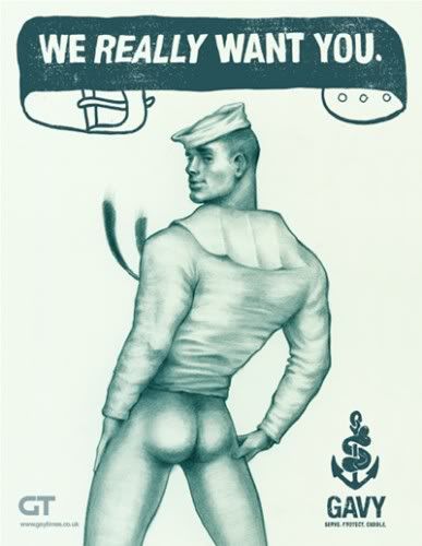
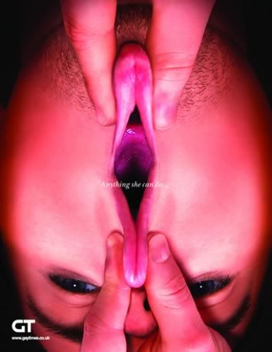
While on the subject of 'gay', I spotted these over on the creative review blog. Here's the official explanation:

Right-wing conservative groups have often accused gay people of having an agenda to promote homosexuality. In response to this, the UK’s Gay Times decided to run an interesting recruitment campaign: selling homosexuality to the straight community. Editor Joseph Galliano explains why he asked five ad agencies to help promote the gay cause…

CR: In light of the recent campaigning in the US, did some of the usual arguments emerging from the far-right help as a starting point for the project?

JG: “Actually, it’s unfortunately much more historical than that. The idea that there’s this ‘homosexual agenda’ is something that has come up many times, over the last 20, 30 years. I find it hilarious, the very idea that gay people might have a coherent set of agendas.

“So I just thought that, if it were true and we were trying to and sell homosexuality, what would it look like? It’s a simple idea really. But the serious point is in highlighting just how ridiculous some of those kinds of attacks are and trying to answer them in a way that’s interesting and creative.”

Photobucket

I think the next one is my personal favorite, it made me laugh, a lot.

Photobucket

I love seeing creative and fun ways to solve problems, and these do the job perfectly, completely trivialising the right wing arguement. GO GAY, YEAHHHH!!!

Wednesday, November 05, 2008

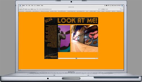
LOOK AT ME!

Just finished building the updated version of illustrator Gus Farnes website. We both developed the format and simplistic navigation system, he then came up with a visual style which I tidied up slightly and then put the whole thing together. It's designed to be really easy to update, and hopefully from now on Gus is fully going to be managing the content. Teamwork!
Photobucket
Lookatmelookatme.co.uk check it out!

Saturday, November 01, 2008

BMW flexiskins

I've never really got excited about cars, I'm pretty sure by the time I can afford to buy one there won't be any petrol left. But, this video about the new skins for BMW cars is really interesting simply as example of completely re-thinking and re-evaluating what is taken for granted. Enjoy

I found this over on the everyoneforever blog, it's an ace inspirational resource covering lots of area outside of traditional graphic design.

Also I think I'm going to submit this at some point over the next few days to the design competition over at popdeck. Any feedback before I do would be lovely! emailmerlin@hotmail.co.uk
Photobucket