Been busy with my web design module this week, helping my friend Gus build a website. It's currently online, but yet to have all the content added. Check it out here. I'm going to be spending some time with him over the xmas period polishing it off.
While helping gus design his site it has got me thinking about this one a bit, and I've decided I want to change it. I think its a bit ugly, and detracts from the images.
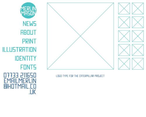
this is my new design idea, a lot simpler and cleaner but still with a strong sense of identity.
Also finished my type module this week, and I'm really pleased with the outcome. It's a pamphlet guiding the reader through the nitty gritty side of type design which folds out into an A2 poster. Unfortunately I've had to hand it in for marking before taking any pictures, but I will stick some up when I get it back after xmas.
Finally, today is the last day of term!
Its been pretty stressful this year, and despite having a few projects to work on over christmas I'm looking forward to turning down the stress-o-meter a notch or two!
Friday, December 14, 2007
Saturday, December 08, 2007
Music, Business & Books
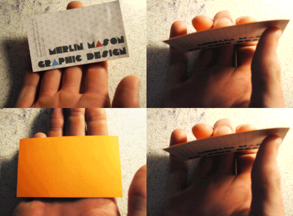
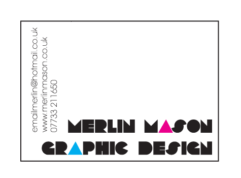
Went to an event today which was designed to bring together bands from Leeds College of Music, and artists from the design college. I decided that today was probably the time to sort myself out with some business cards (something that I've been meaning to do for a while). So printed a few of these off from home onto isometric paper backed with thick coloured card. Think I'm going to get a few small changes made to these and then get them printed professionally.
Met a few people from different bands, and exchanged contact details, so hopefully they'll be some collaboration work coming out of this. I've always liked the idea of doing design for bands, but never known anybody who was in one, hopefully that will all change now :)
A little update on the interdisciplinary group RSA competition brief I'm doing at the moment.
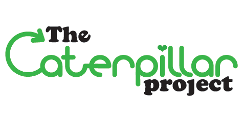
This is the logo for I've designed for 'the caterpillar project' a hypothetic government initiative to educate and motive primary school children to recycle. The name comes from the custom built recycling bins being made for the schools which are caterpillar shaped. These can be custom built in sections for each classrooms individual needs, and can easily emptied into a larger bin by the children, involving them more in the process. My role in the project is all the graphic identity, including this logo (the caterpillar bit is a custom drawn typeface especially for the project), I'm also responsible for the design of posters and leaflets and all other print related collateral with the project.I'll put more pictures when I get them!
Finally...
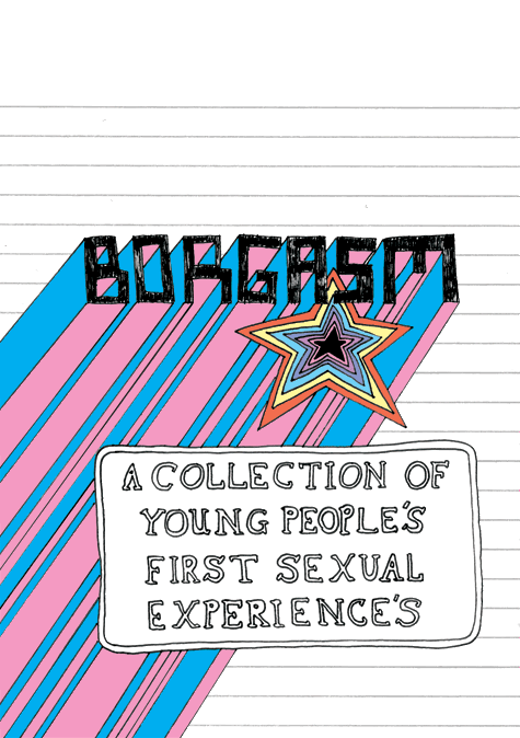
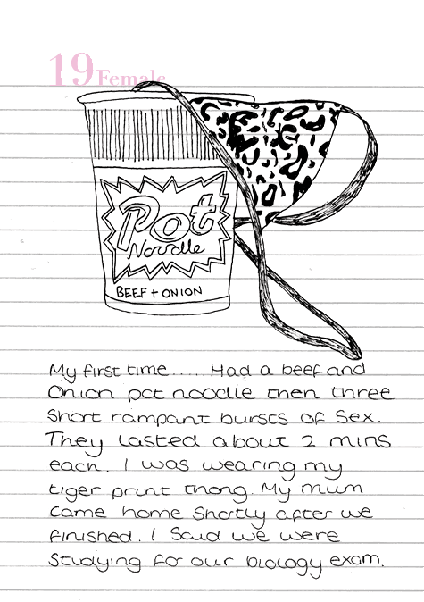
finished the book I was making for my collections briefs,
here is a few pages for you to look at!
Right, thats enough of that... I'm off to bed, ta-raaa x
Saturday, December 01, 2007
It's book O'clock!
Hello!
Just a quick overview of some of the books I've been looking at recently as research for various projects.
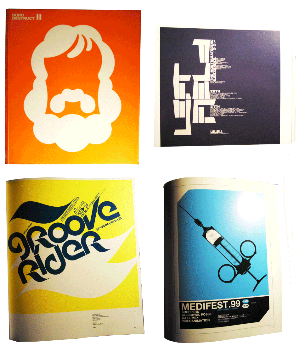
First up is the 'Buro Destruct" book.
Contemporary, clean swiss graphic design with an emphasis on typography. Despite being only a small studio of five or six people, they have built up an international reputation and work for a whole variety of clients.
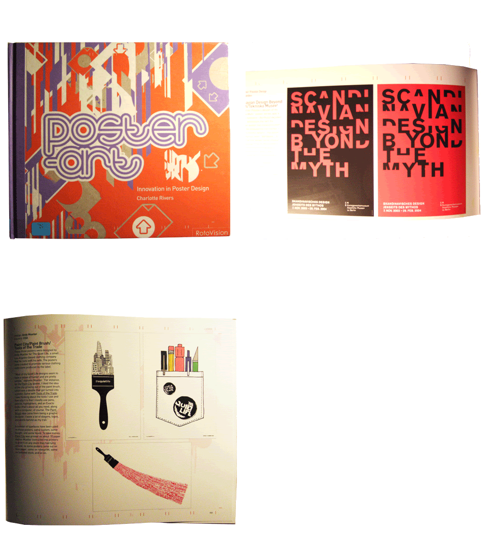
Next up is 'Poster Design',
Showcasing the best of modern poster design, it features work in a wide variety of styles, and has some great typography in it.
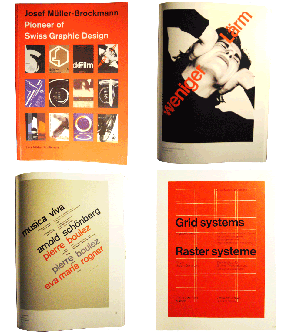
Then we have the Josef Muller-Brockmann book 'Pioneer of Swiss Graphic Design'
Muller-Brockmann was one of the leading designers of the 'swiss style' during the 1950s &1960s. This book features all his best and most experimental work. I really like the simplicity and cleanness of the swiss style, and it still looks contemporary to this day.
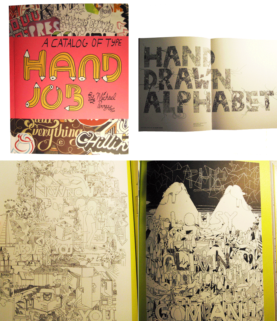
Finally, we have 'hand job', and I actually bought this one!
It's by New York based artist Mike Perry, and is a catalog of hand rendered type styles. Needless to say I love it, and I'm glad I forked out some money for once! I really enjoy hand drawn type, in the day and age of computers it is such a rarity that people can be bothered to make the effort! I'm going to try and do more of this in the future!
Oh and finally, I've started work with illustrator Gus Farnes on his portfolio website. We've registered a domain, and I've put a mini disco there while we construct the site. Everything going well it should be online in about two weeks.
www.lookatmelookatme.co.uk
Ta-raa x
Subscribe to:
Posts (Atom)