This is going to be short and sweet, I'm tired, it's late and I've got to be up early!
First up, I've been busy over the last week putting together a website for bicycle circumnavigation world record challenger Julian Emre Sayarer, it's just gone live this evening although it still has a few things to be added to it.
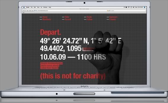
His bike ride essentially a protest against so many things in todays society which he feels are sliding away from us as individuals and losing their meaning. He has written a great manifesto on the site and if you have time please give it a read!

The visual style for the whole thing was influenced heavily by this quote (from creative review I think) describing last years climate camp visual identity by UHC.
"The crisp design produced by the Climate Camp is removed from the typical anarchist/Marxist/revolutionary visual codes of earlier activists movements. The Climate Camp’s graphic identity aims to be attractive to everyday people; it is accessible and asks everyone to participate. Gone are the stencilled or dirty grunge fonts that are identified with your counter-cultures. In an era when our rebellion has been sold back to us for so long that the aesthetics of rebellion are virtually meaningless, the Climate Camp has avoided positioning itself with any of the counter-culture based identity politics of earlier activists movements that could never escape the anarchist ghetto. So far, the camp has stayed clear of old ideology-based rhetoric and imagery, but is a constant battle to maintain a fresh perspective and communications strategy."
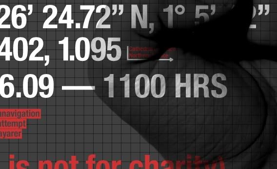
ThisIsNotForCharity
In other news I've also been developing the visual identity for the Leeds College of art end of year show. Here's a sneaky glimpse at a print ad for Kult Magazine. Also working on adverts for creative review, freize magazine as well as VIP invites, posters, on site signage, window graphics and exhibition guides. More soon!
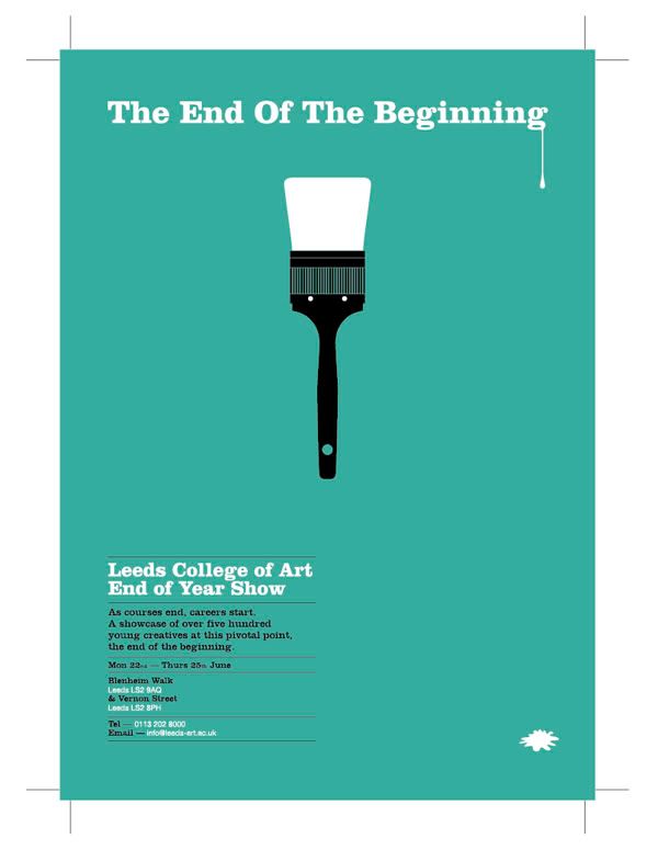
I've also been playing with my camera a little bit which has been a fun break from working.
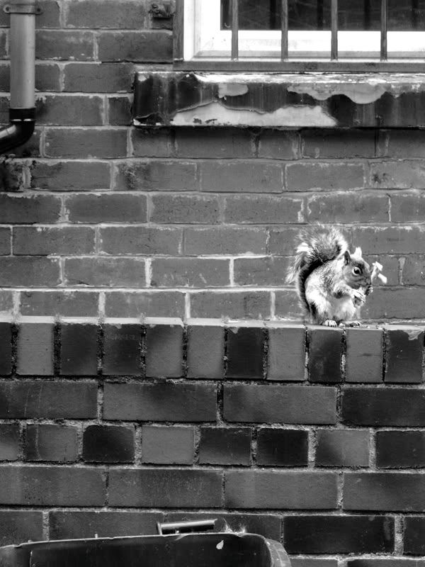
Took this snap of a squirrel outside my house eating a chicken leg, my first official steps into wildlife photography!
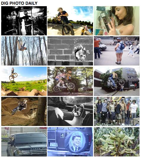
It also earned photo of the day over on the DIG Magazine website, ace!
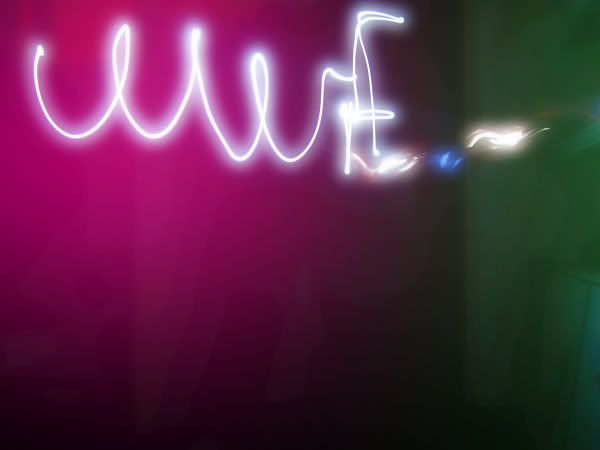
I also took this a few weeks back during the WWF (wildlife not wrestling) earth hour.
I think that about does it, I'm off to bed!
Merlin x
